Well, I am not exactly a technical writer .. yet. But expressing my work with words and simplifying processes has always been one of my favorite things to do. I plan to build on this and create a platform where I can put my knowledge base to use by dissecting complex ideas and processes with the aim of making things simpler and generally passing information.
Okay, to the reason for this article - my portfolio page. I completed my portfolio page about a week ago but I could not exactly find the right way or platform to put it out. Then I remembered I just registered on hashnode and I even integrated it into the portfolio page itself. The portfolio page was built with the React framework integrated with several npm packages for utility. I have gotten quite comfortable react, moving up to NextJS has been easy so far (I'm sure I can set up a new react project even with my eyes closed haha).
Alright let's cut to the chase. The template used for this portfolio project was gotten from the colorlib website. I originally built a multi-page portfolio site with react-router. However, a lot of portfolio pages I came across were single-page sites which led me to create a v2 which was the single-page version of the one I originally created (this was the one I deployed).

I have always found it easy to organize pages and data in the codebase into different folders. This makes it easy to update the code and solve errors if need be. The folder structure:
A "Pages" folder to handle all the page components rendered in ".js" (I prefer this to the ".jsx" extension).
An "assets" folder that also holds an image subfolder for all images, pdf files, logos and svgs used locally in the project.
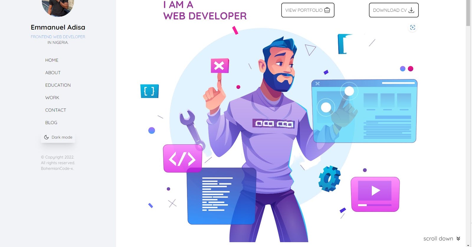
A components folder that usually holds the navigation component (generally called the navbar). However, in this case, I used a sidebar which sits side-by-side with the pages and is also fixed. It housed the introduction, different nav options, the dark-mode button and the footer.
A context folder that housed the ThemeContext.js file. This handled the dark mode functionality with the use of the built-in useReducer and Context functionalities from React.
A hooks folder that housed the useTheme.js hook used in the project also used to apply the dark mode functionality. This folder can also store other hooks like the useFetch (which was not used in this project).
The styling was handled completely with TailwindCSS. This framework has proved to be really helpful and easy to learn. They have an edge over bootstrap and others because of the really ground-level styling process. They also have an icon library called hero-icons which often comes in handy. I used the quicksand font from google fonts and the hero image is from freepik.
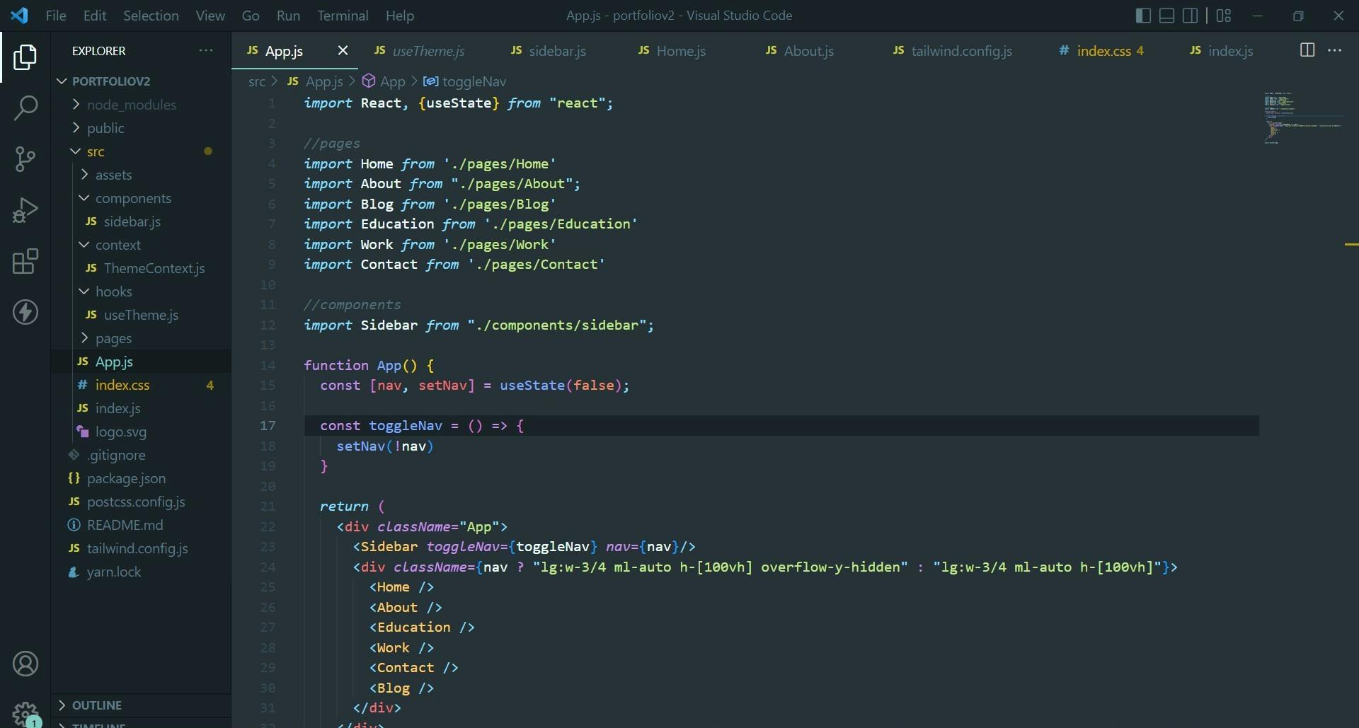
One of the major challenges faced was disabling background scrolling when the mobile modal is active. The background scrolling was obvious because I used a transparent frost glass-like background for the mobile navigation menu. I tweaked the codes for several days to no avail but just like every good challenge, it came to and end. I moved the local state controlling to the nav from the sidebar component to the app.js and also defined the toggle function inside the app.js file as well. Then I passed both down as props into the sidebar. Doing this meant I could control the overflow-y option of the pages from inside the app.js whenever the nav state is set to true with the toggle function.

This project opened me up to the various resources and packages available to react projects via NPM like the scroll-to-top package which I integrated. The link to the deployed portfolio via vercel is (portfoliov2-single-page-git-main-bohemianco..).
Comments and suggestions are definitely welcome. Future versions of this project will include the use of Scrolltrigger from GSAP (I find this package quite interesting, useful and well put together) and the default mode will be dark mode.
If you made it to this line, Thanks for reading.
